

The need
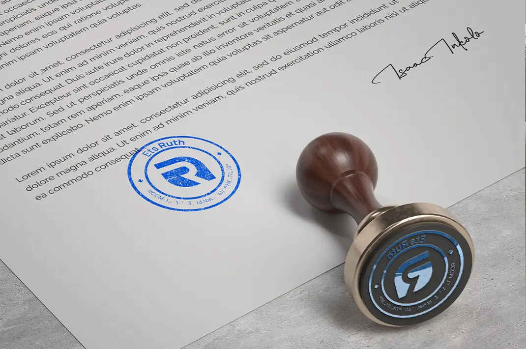
Ruth Établissements needed an identifiable visual symbol to support its communication. The design focused on a simple form that would remain legible on documents, digital media and at small sizes.
Case study
Creation of a modern, recognisable logo to structure Ruth Établissements’ identity.
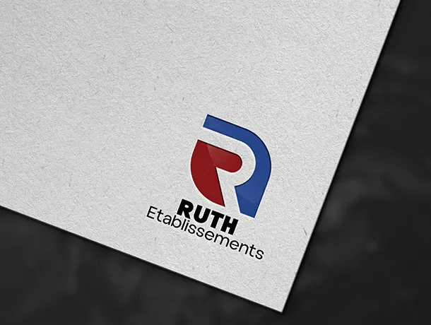
Creation of a modern, recognisable logo to structure Ruth Établissements’ identity.
Ruth Établissements needed an identifiable visual symbol to support its communication. The design focused on a simple form that would remain legible on documents, digital media and at small sizes.
The logo combines clean lines with a stable composition. This construction gives the brand a professional presence without relying on complex graphic effects.
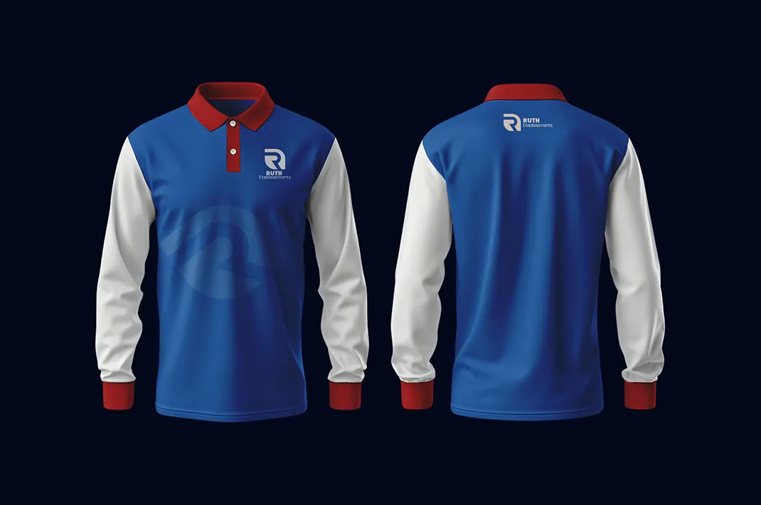
Red and blue create clear contrast and offer several possibilities for variations. Versions adapted to light backgrounds, dark backgrounds and monochrome use can therefore be used as needed.
This logo is the starting point for Ruth Établissements’ visual identity. It allows the company’s documents, publications and other materials to be gradually unified.
Discover other projects completed by NZIM GROUP.
Let’s build what comes next together
An idea, a need or a question?
Let’s discuss what we can achieve together.