

The need
Acme Studio wanted an identity that could represent a space dedicated to sound production and artistic creation. The project therefore sought a balance between visual energy, simplicity and ease of use.
Case study
Definition of a contemporary visual identity to support Acme Studio’s musical and creative activities.
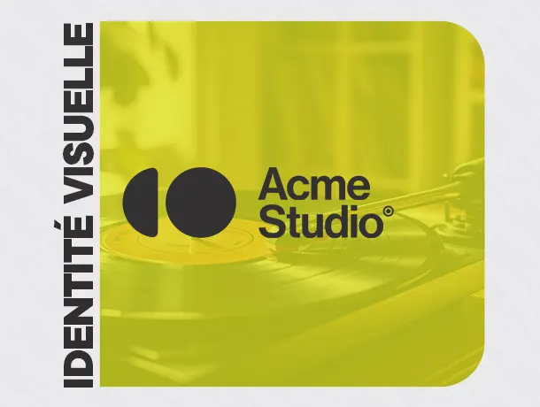
Definition of a contemporary visual identity to support Acme Studio’s musical and creative activities.
Acme Studio wanted an identity that could represent a space dedicated to sound production and artistic creation. The project therefore sought a balance between visual energy, simplicity and ease of use.
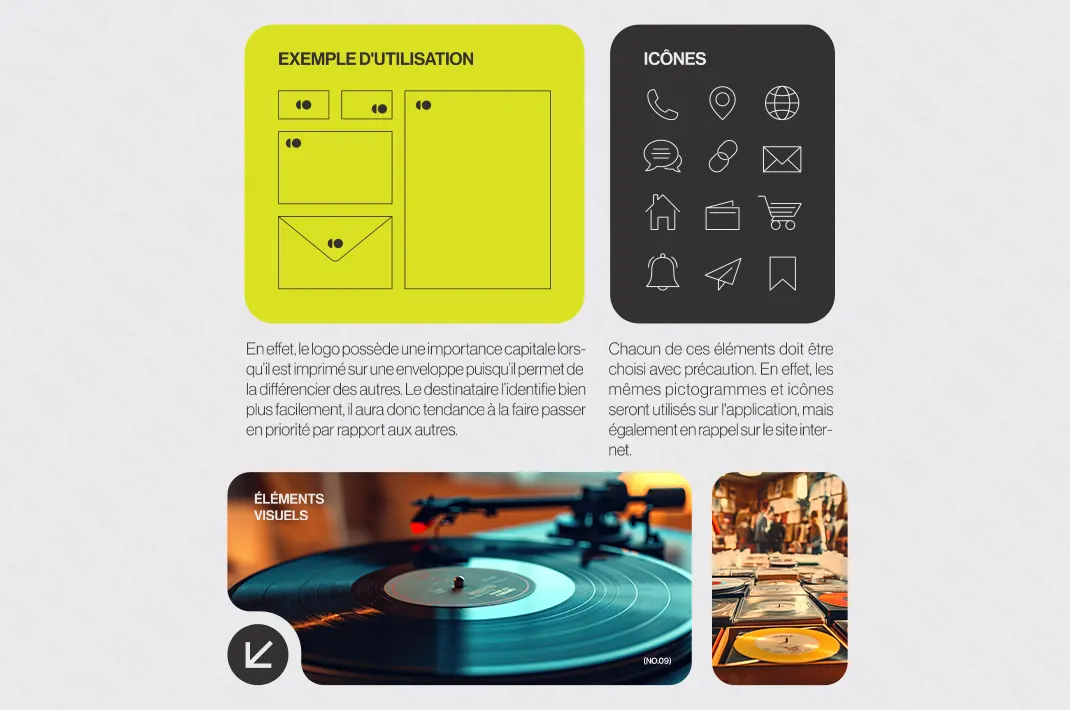
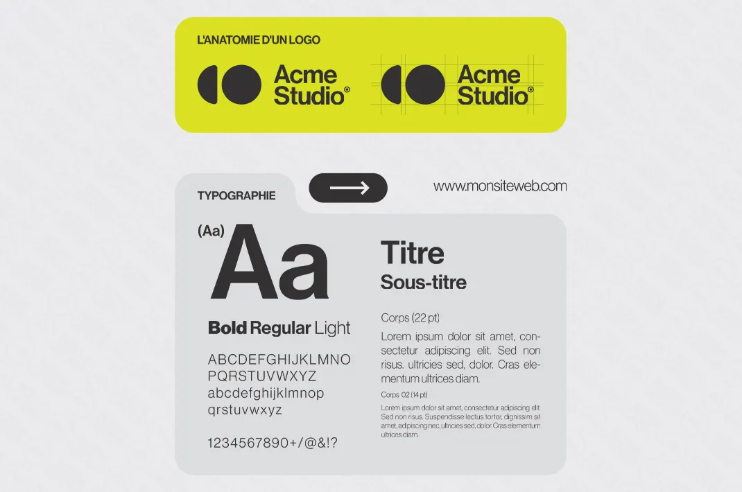
The logo uses geometric shapes that evoke rhythm and structure. The typography complements this construction with a contemporary presence without making the whole design difficult to read.
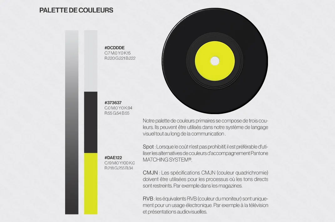
Yellow provides a strong point of reference in the palette, while supporting colours allow the identity to adapt to different backgrounds and materials. The graphic rules were designed to maintain a consistent appearance.
The guidelines bring together the main logo uses, colours and typography choices. They give Acme Studio a clear foundation for preparing future print and digital content.
Discover other projects completed by NZIM GROUP.
Let’s build what comes next together
An idea, a need or a question?
Let’s discuss what we can achieve together.