

The need
The aim of this project was to bring movement to the MAK Construction logo without changing its identity. The animation needed to be suitable for presentations, corporate videos and a range of digital content.
Case study
Animation of the MAK Construction logo, designed to respect its shapes and visual identity.
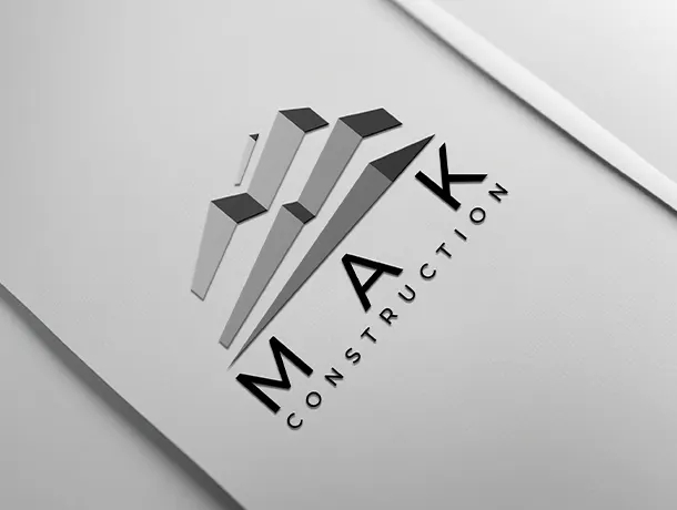
Animation of the MAK Construction logo, designed to respect its shapes and visual identity.
The aim of this project was to bring movement to the MAK Construction logo without changing its identity. The animation needed to be suitable for presentations, corporate videos and a range of digital content.
The work focused on the order in which elements appear, the pacing of transitions and the overall duration. Movement was deliberately restrained to preserve a sense of stability consistent with the construction sector.
Graphic effects support recognition of the logo rather than distracting from it. This approach makes the brand quickly recognisable, even when the animation is included in a short sequence.
The final version can serve as an opening or closing for audiovisual content. The video shown on this page demonstrates the logo in motion.
The YouTube player loads only after you click and uses your Internet connection.
Discover other projects completed by NZIM GROUP.
Let’s build what comes next together
An idea, a need or a question?
Let’s discuss what we can achieve together.